< Projects
Data Navigation Concept Explorations via R.I.T.E. Method
MY ROLE | Lead User Researcher:
Co-creating the Product Requirements Document
Facilitating internal interviews + co-building user flow maps
Co-defining product design approach
Concept ideation, and sketching, and wireframing
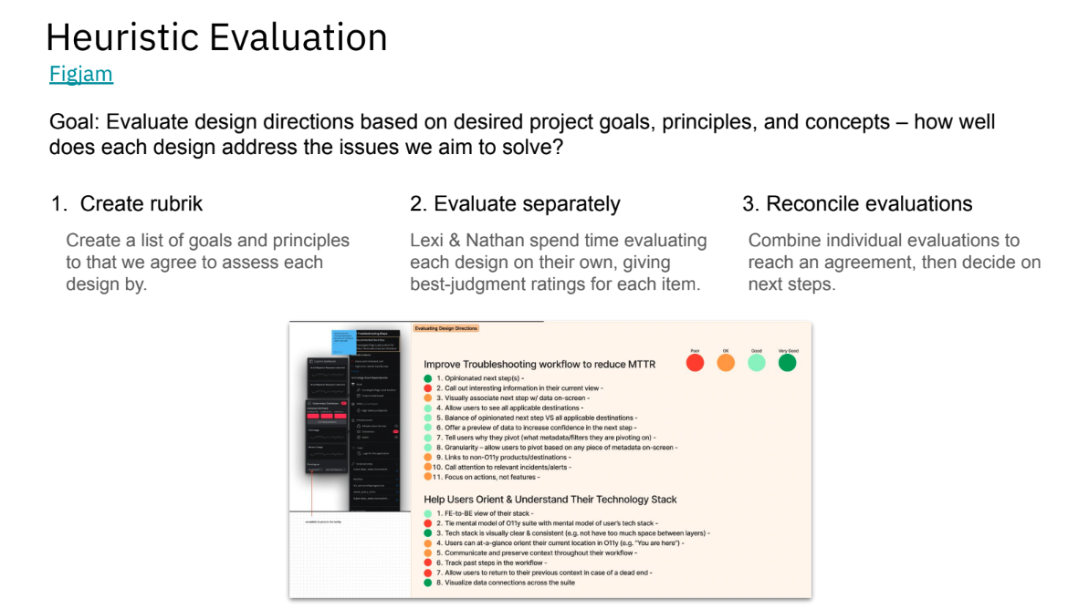
Designing / defining heuristic evaluation rubrics
Designing, organizing, facilitating, and analyzing each round of testing
Co-presenting project updates, design process, research reports
Note: all figma designs and prototypes are created by Alexandra Nuttbrown, my talented design partner on the project.
DURATION | ~3 months (this was a side project that was only allowed to take 20% of our total work time, and was temporarily paused for a short period due to other priorities)
IMPACT |
Prioritized improvements to existing navigation features.
A product team from another Splunk product built their own “Data Navigation” feature based on our explorations.
Project process was shared with broader Design Organization to encourage its replication.
DIRECT STAKEHOLDERS | Principal Product Manager, Sr. Director of Product Design, Sr. Manager Research and Design.
METHODOLOGIES | Rapid Iterative Testing & Evaluation (R.I.T.E. Method), Heuristic Evaluations, Ideation Workshop

The problem
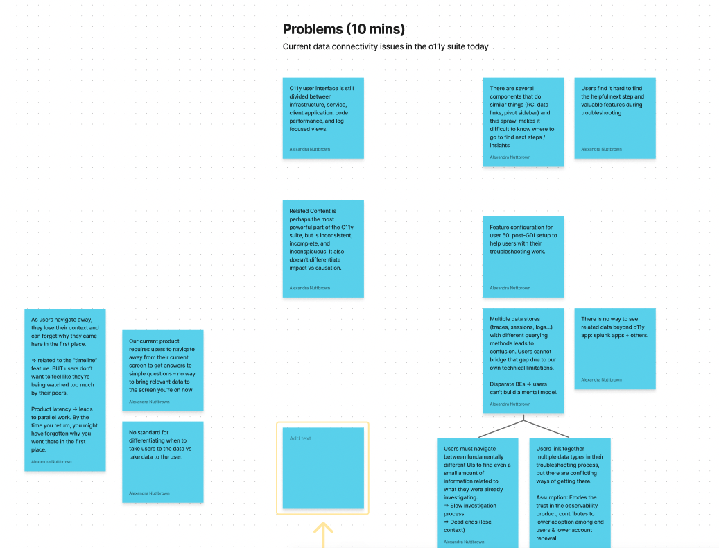
Splunk Observability Suite is an amalgamation of ~5 acquired products, each built in a silo, which presents significant pain points when users want to navigate to relevant views between products.
Known pain points included:
inconsistent navigation features & components between each product in the suite
loss of context when navigating between products
users find it difficult to orient themselves in the suite & their tech stack, especially when navigating between products
background
A previous project sought to address these navigation pain points — but the leads on the project both left the company for other opportunities. My design partner Alexandra Nuttbrown and I saw potential in the project, and decided to pick up where it was left off.
We convinced design leadership to let us scrap some of the existing decisions, re-evaluate the scope of the project, and take a user-centered approach to this design-led initiative.
Note: This project was seen as a side-project that we allowed to take ~20% of our time.
research questions
Do users engage with Related Content currently?
If so, how? When do users use related content? Is related content useful today – why or why not?
If not, why? Do users know it exists?
How can we increase the value of related content?
How do users access logs today?
When in their journey do they get to logs? How do they get to logs? What tool & what path do they take?
Once they get to logs, what do they do? What are they looking for? What actions do they need to take to find what they are looking for?
Today, how do users jump between layers/views of their stack? When do they pivot, and what are they looking for?
How can we help users with this pivot?
What are the journeys that users take through Splunk’s different Observability products?
From each page in each product pillar:
Where would a user want to go from here? Top destinations inside of this product pillar? Top destinations outside of it?
What questions does a user have from this page?
process (before r.i.t.e. began)
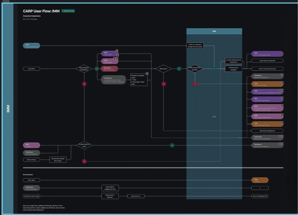
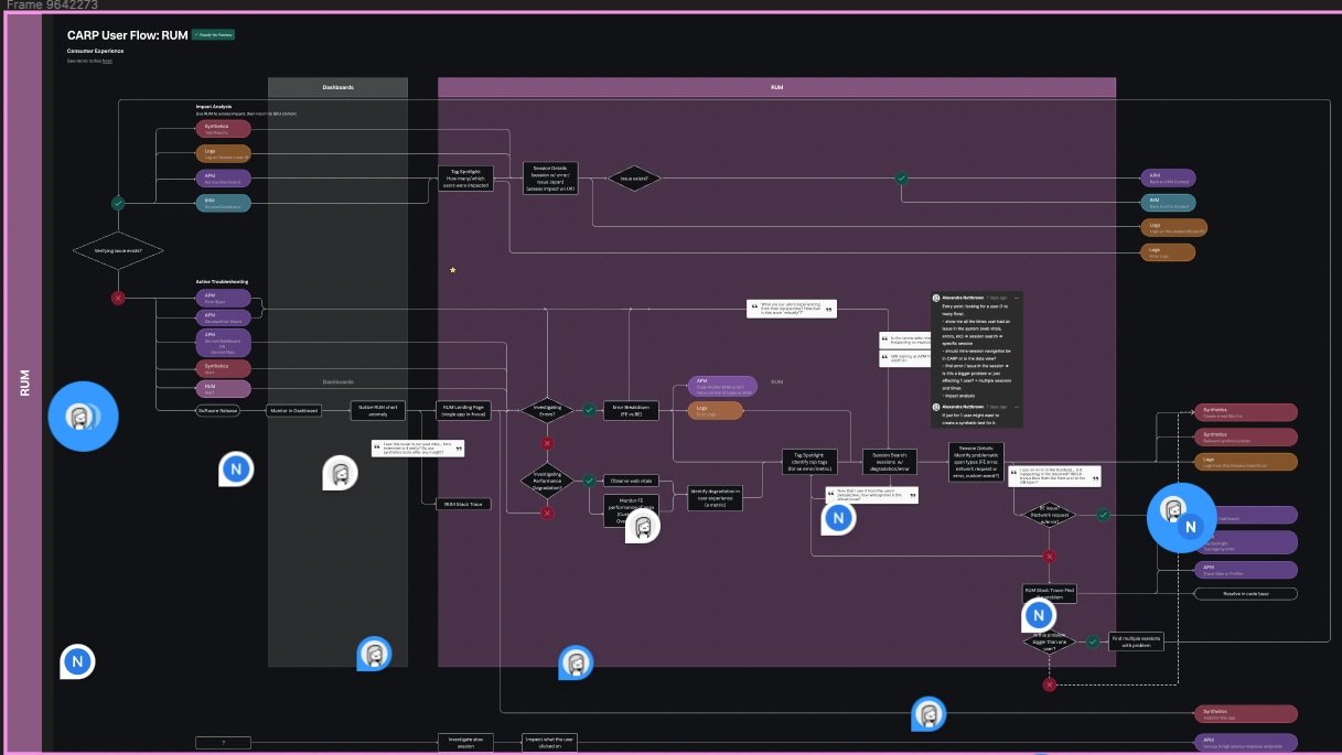
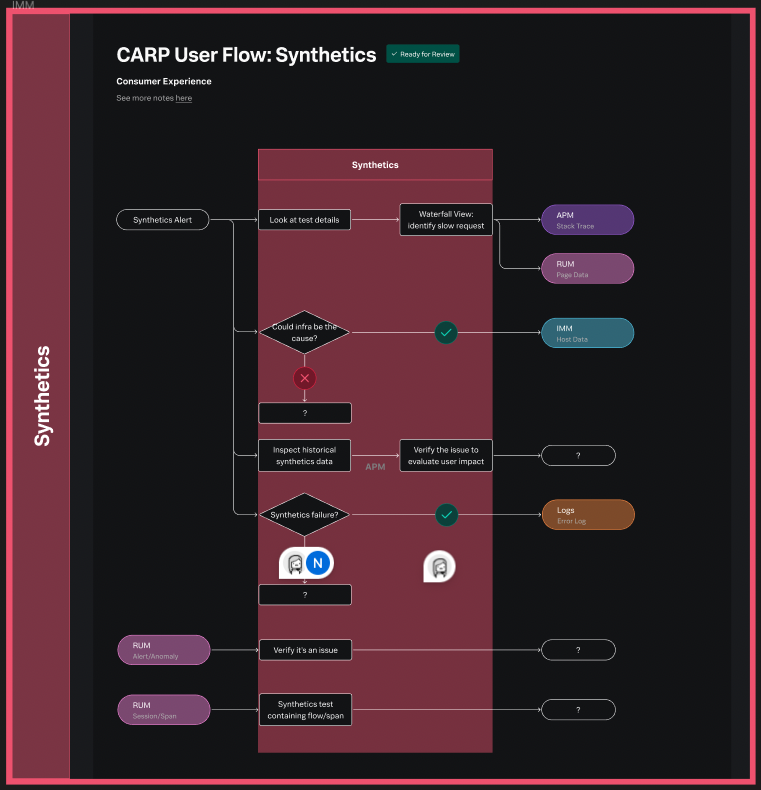
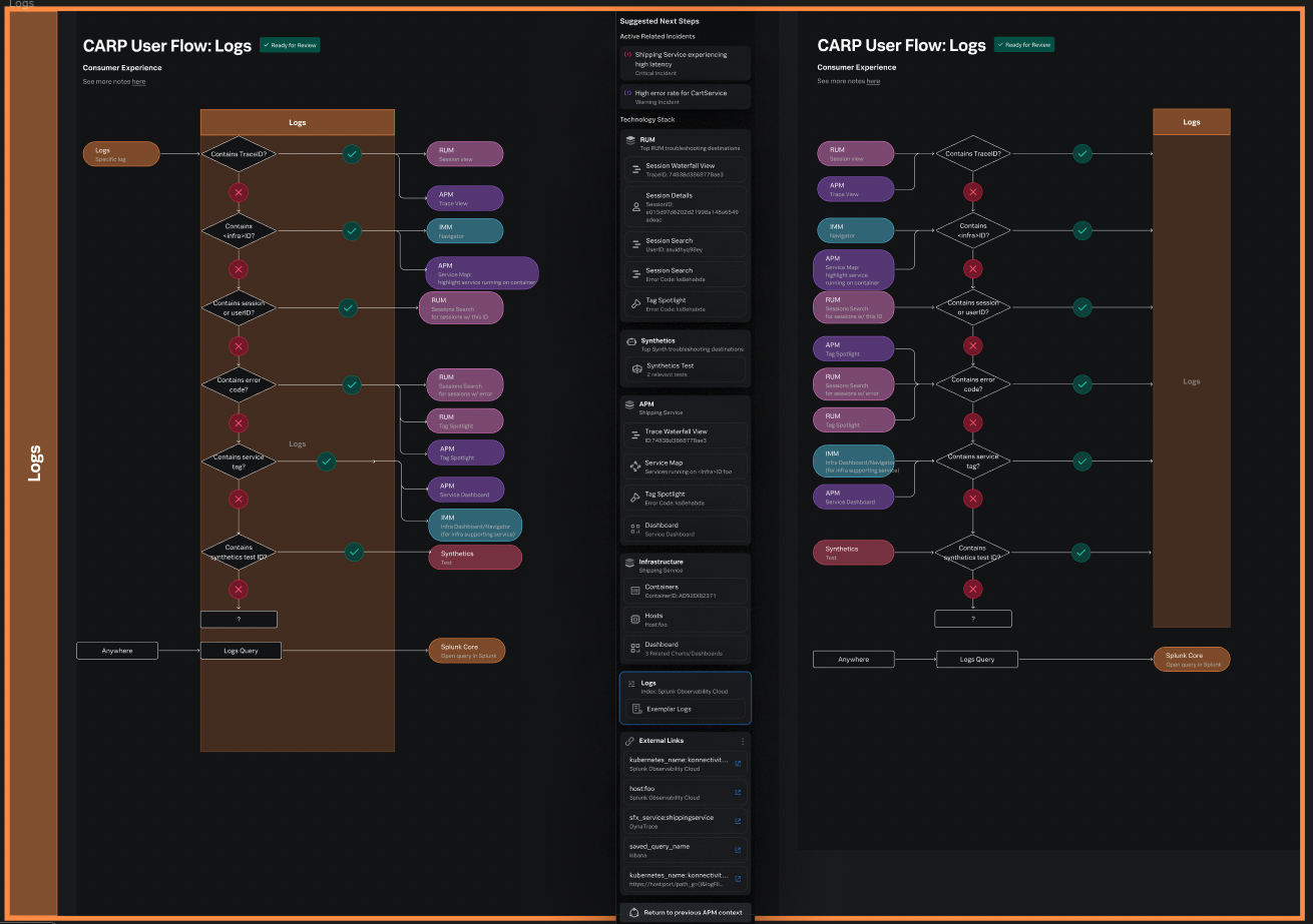
1. user flow map audit + internal interviews
We took inventory of all possible user flows through Splunk Observability’s various products and features.
We interviewed designers and PMs within each of the Observability product teams to map out the user flow for each.
We also referenced telemetry data to determine common navigation paths through the Observability Suite.
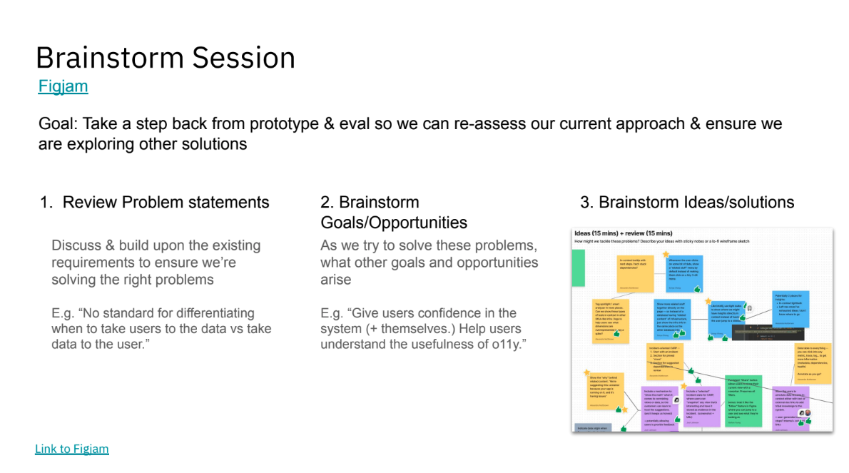
2. ideation WORKSHOPS
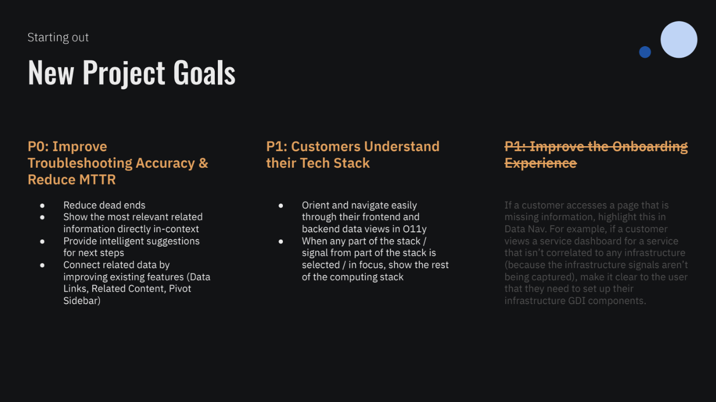
Without a PM on the project, Alexandra and I created our own Product Requirements Document and circulated it for feedback.
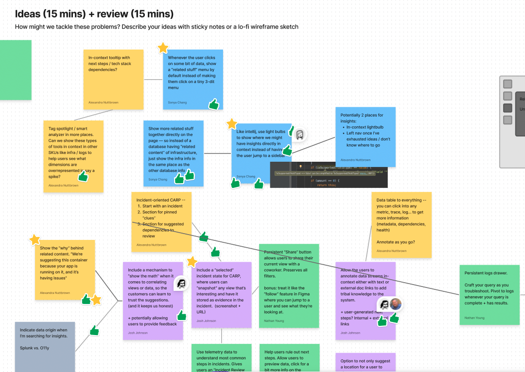
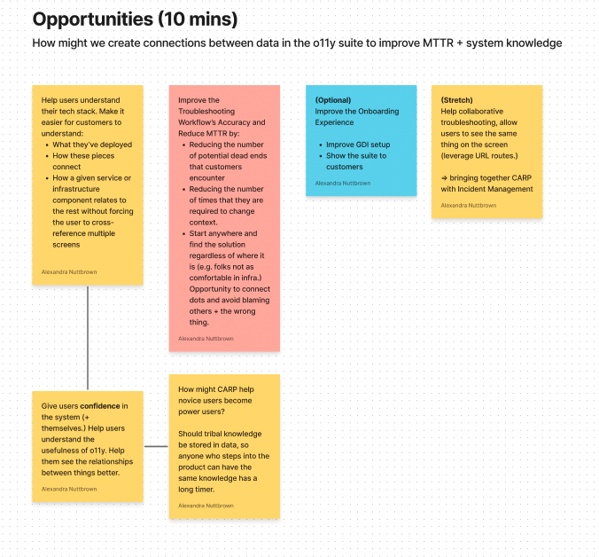
We assembled a team of designers who were familiar with the project and facilitated a ideation workshop, encouraging “crazy” ideas unrestrained by feasibility.
We then grouped similar ideas and identified some common themes.
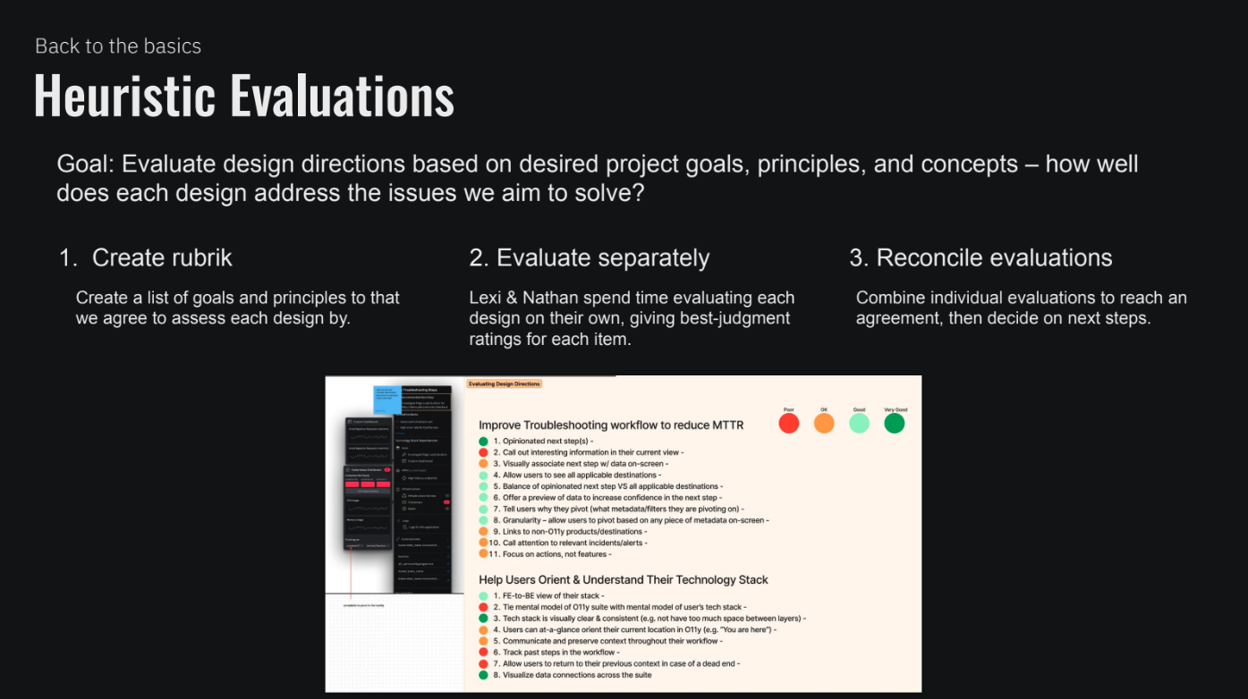
3. Design explorations + heuristic evaluations
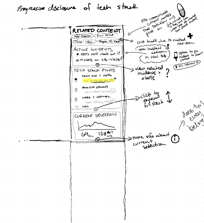
Alexandra and I held working sessions to start sketching & wireframing the ideas into reality.
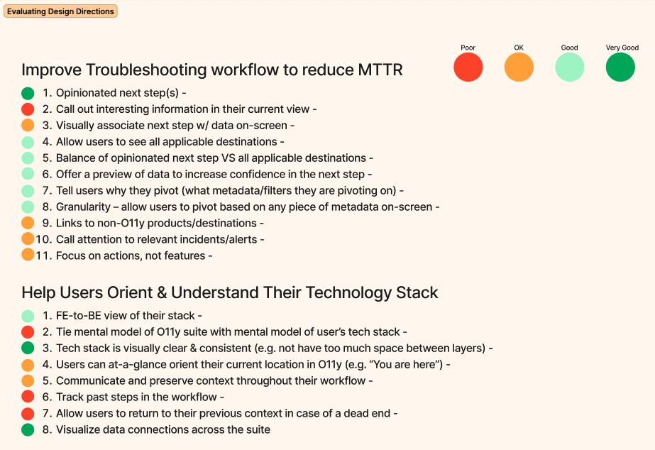
I developed heuristics, based on the product requirements we developed together, with which we could evaluate each of the ideas.
We used our heuristics rubrics to individually evaluate each design concept, which allowed us to more objectively choose a concept to bring to testing.
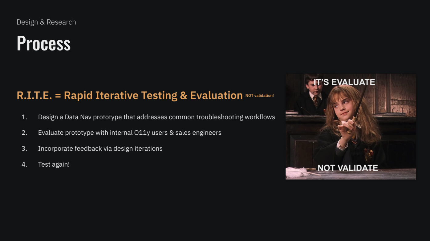
rapid iterative testing & evaluation (r.i.t.e. method)
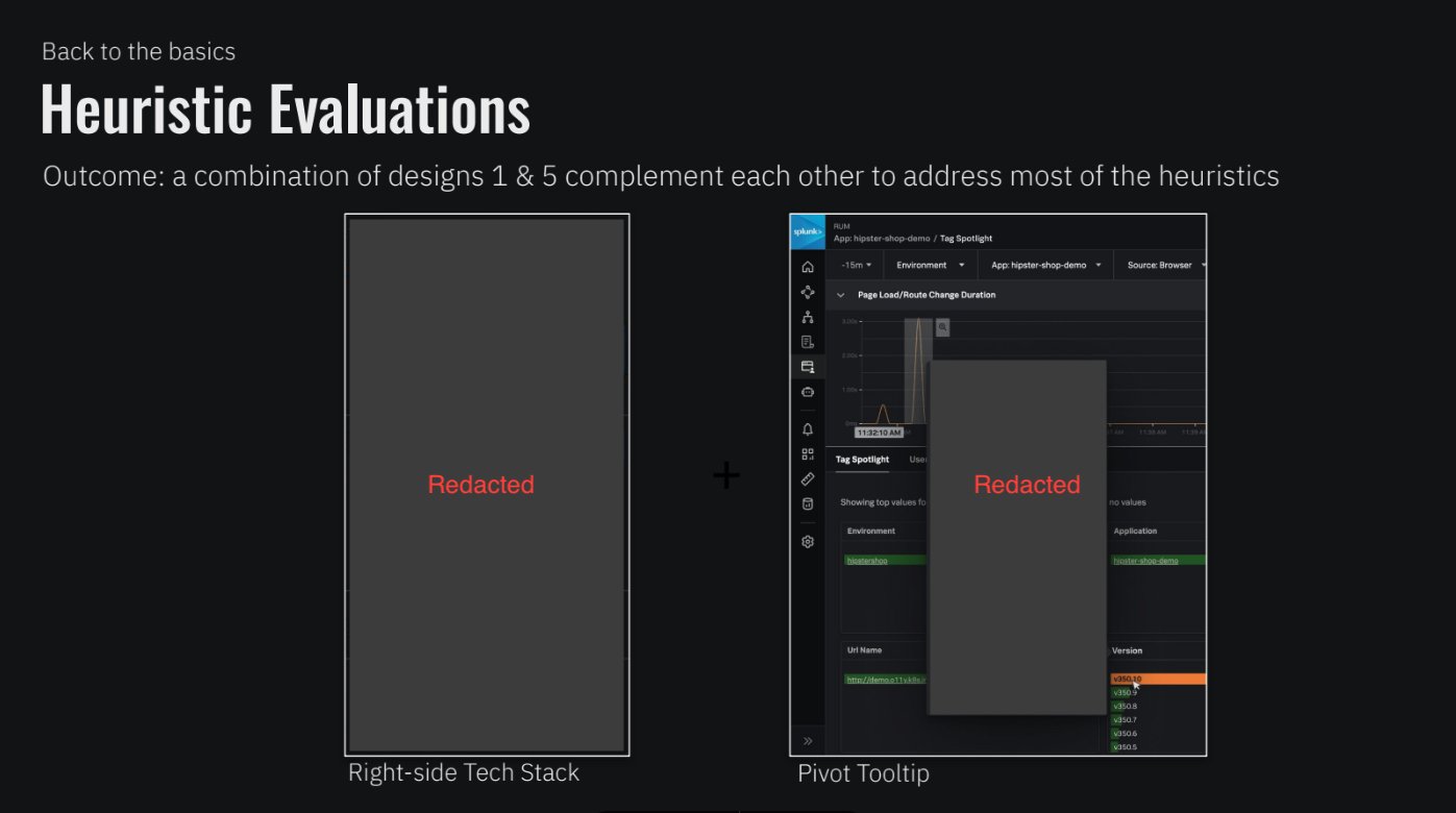
As a result of our heuristic evaluation, we decided to combine the best aspects of 2 different design concept explorations. Weaknesses in one concept were complemented by strengths in the other, thus a hybrid was born.
round 1

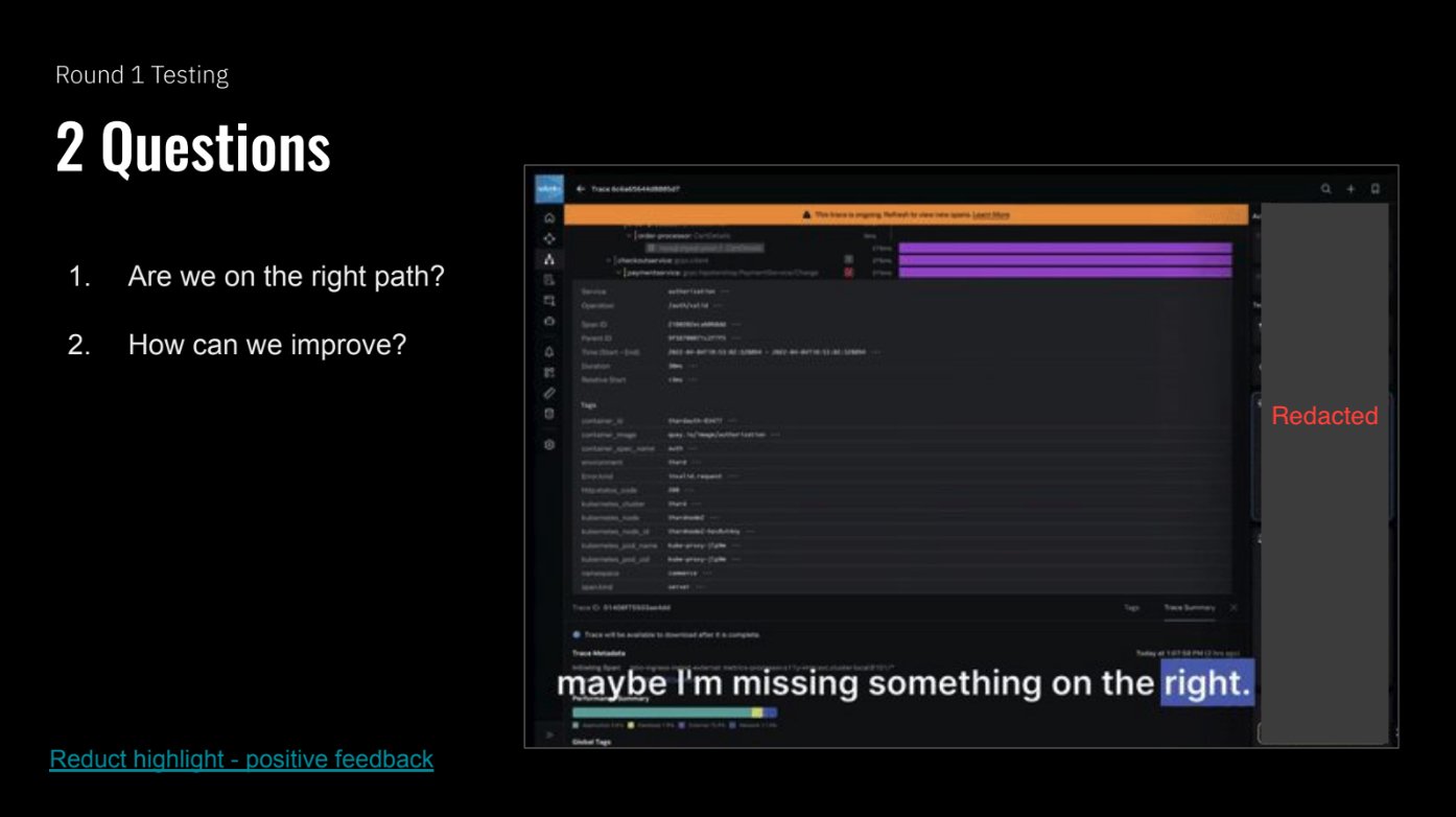
Screenshot of a Reduct video board that I created. Video boards allow you to highlight sessions, group clips, take notes, and easily create highlight reels. Video clips are the most effective way to bring stakeholders closer to the research findings.
We tested with 3 customer-facing internal participants who are not only users of Observability themselves, but are also intimately familiar with customer pain points due to their role as Sales Engineers.
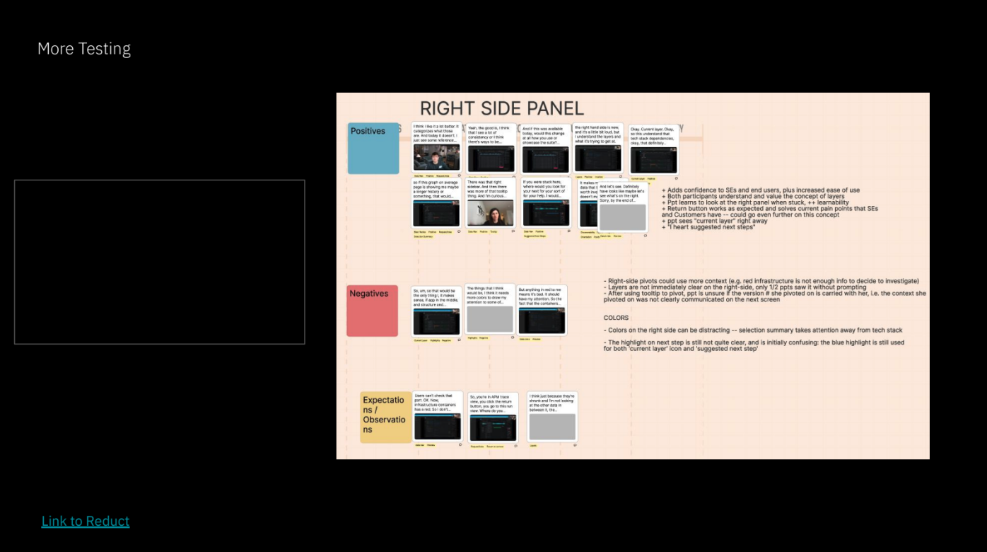
Analysis (right)
Using Reduct (a video analysis tool created for user research), I collected clips from each of our sessions, compiling them into positives / negatives / observations for each feature concept that we were testing.
I created highlight clips to make it easy for an audience to quickly see for themselves.
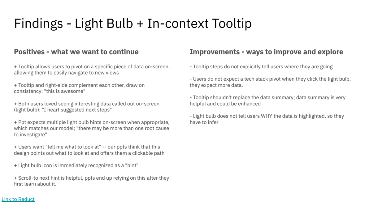
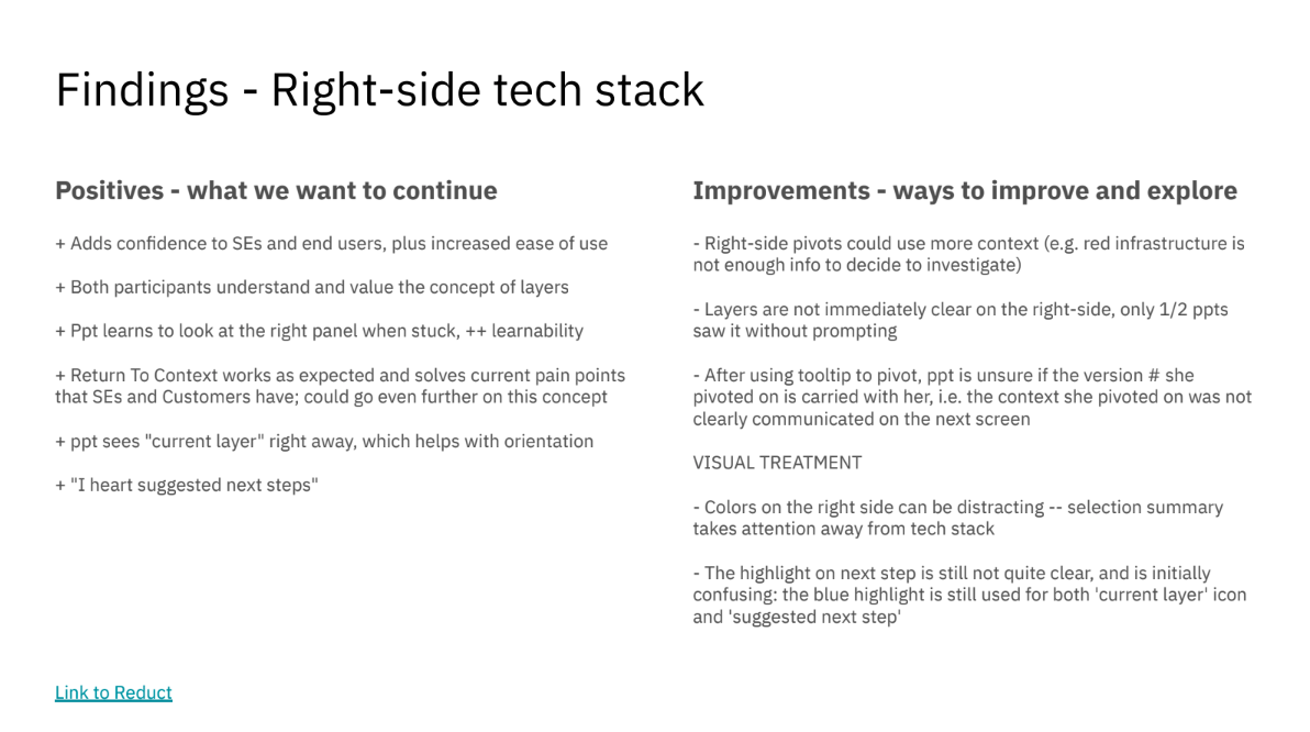
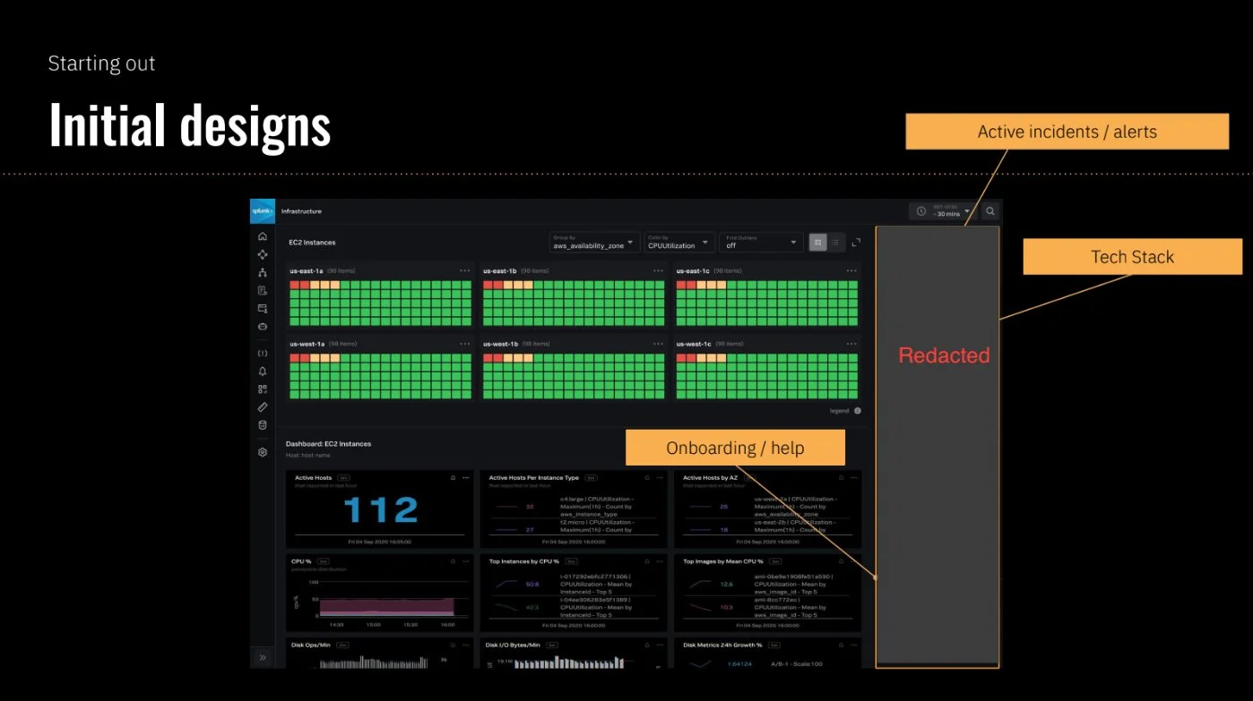
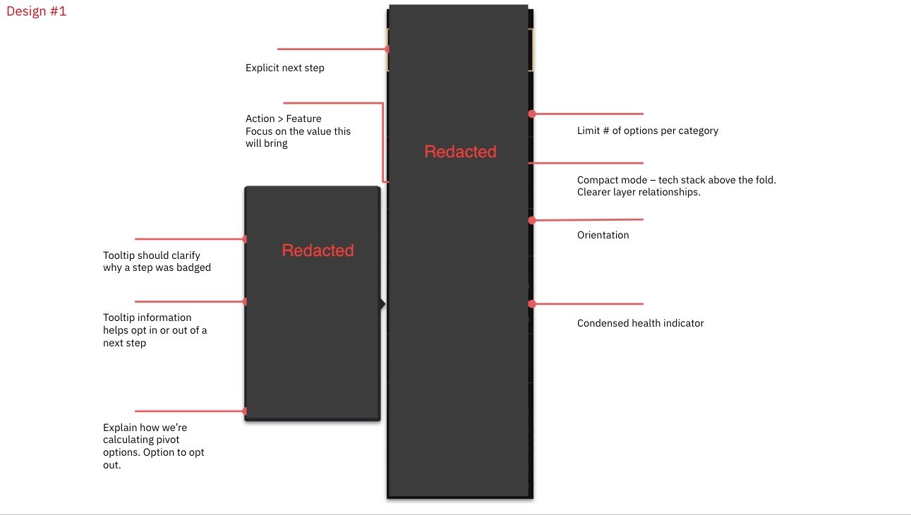
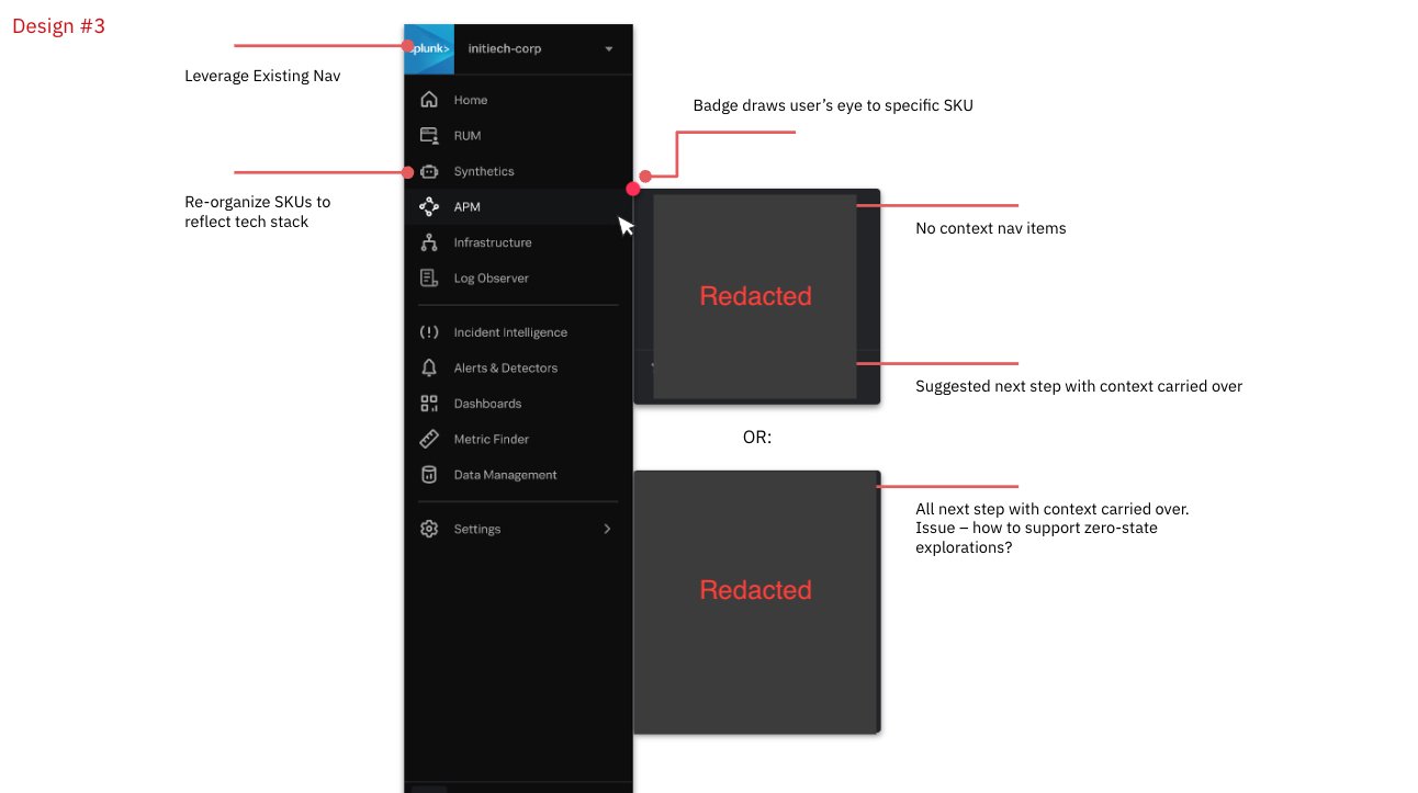
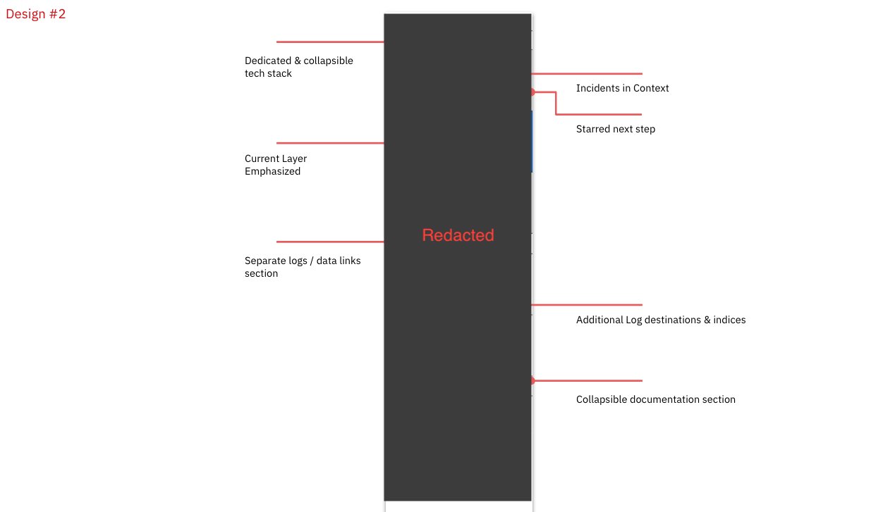
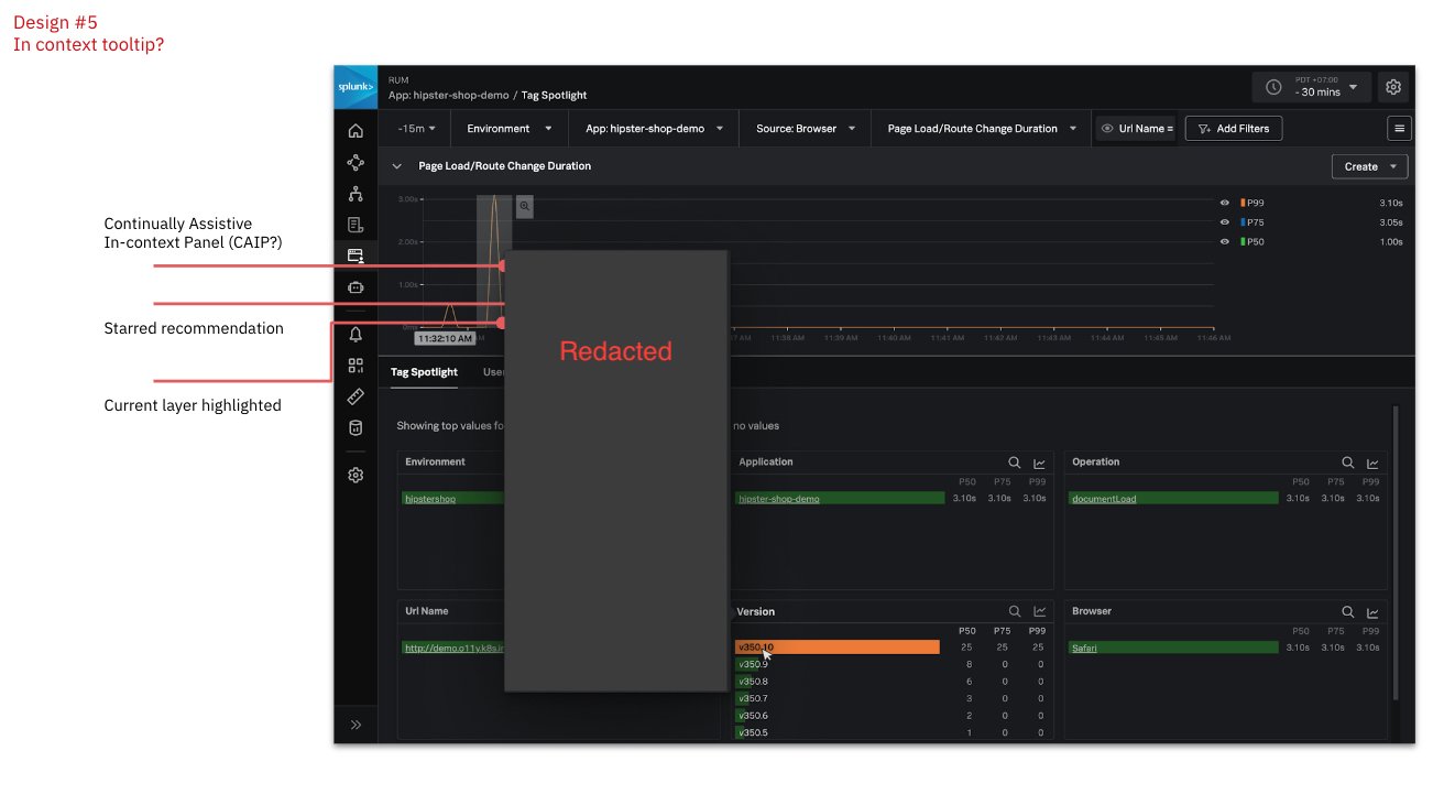
Designs and findings from Round 1 of testing. Some details have been redacted.
Rounds 2 & 3
We repeated this process for 2 more rounds, for a total of 3 rounds of testing. Between each round, we would review the findings and setup working sessions to ideate and take action. We aimed for 2 participants per round, with the 3rd round including a 3rd participant.
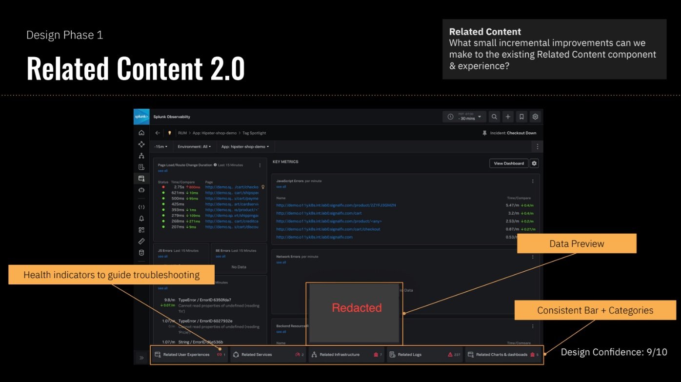
To increase the likelihood that this project would get picked up by PM, we broke down the Data Navigator into 4 distinct features — complementary, yet also viable and useful as standalone features. We shared our process and outcome as widely as possible, shopping it around to different product teams, and eventually found a home for 2 out of the 4 features, one of which is now live in the product while the other is currently in development.
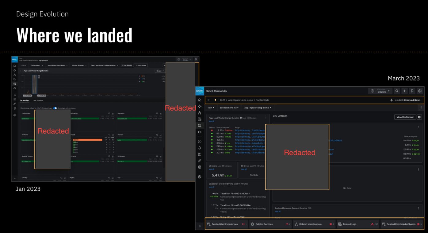
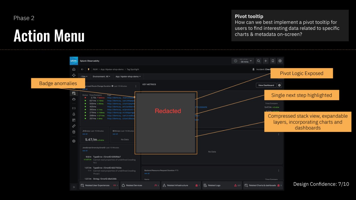
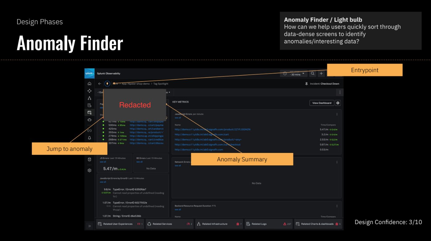
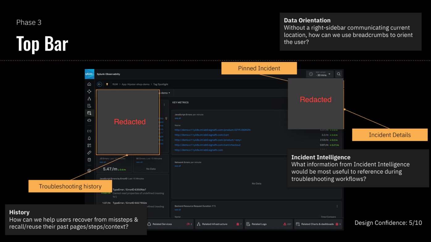
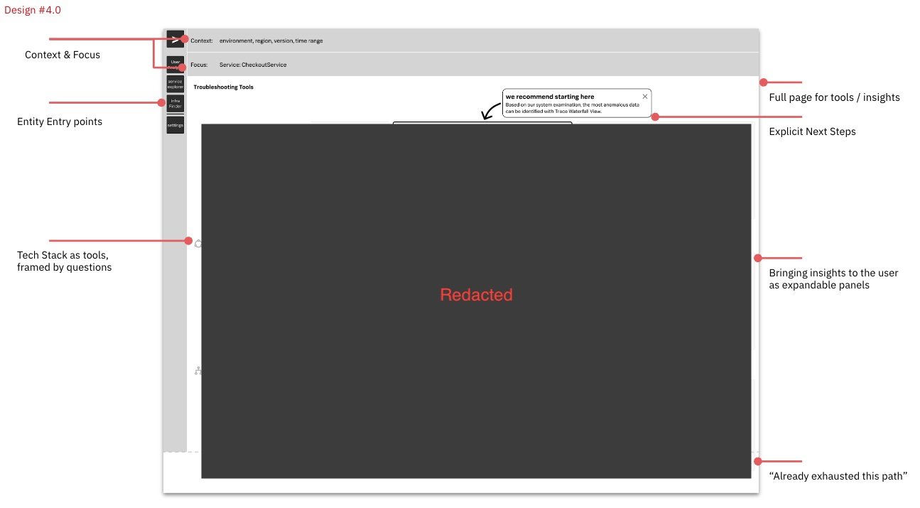
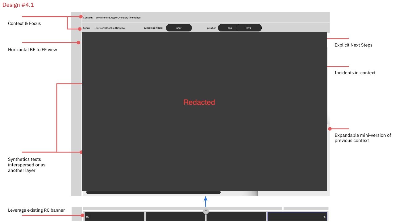
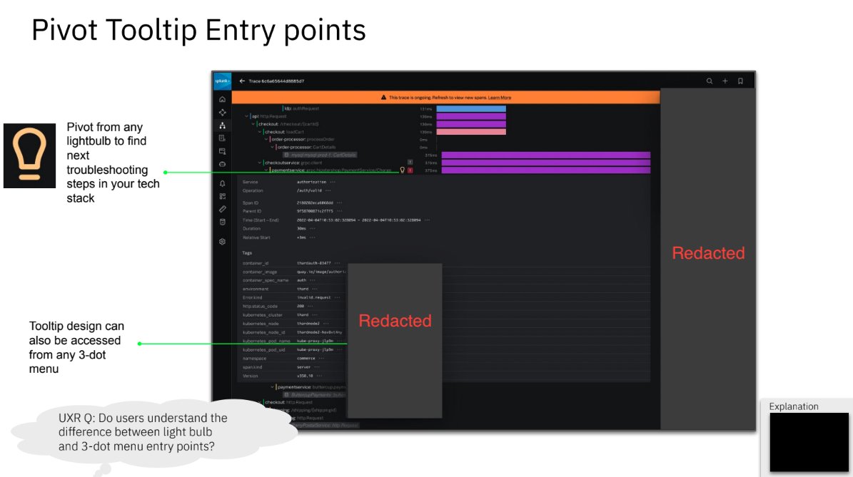
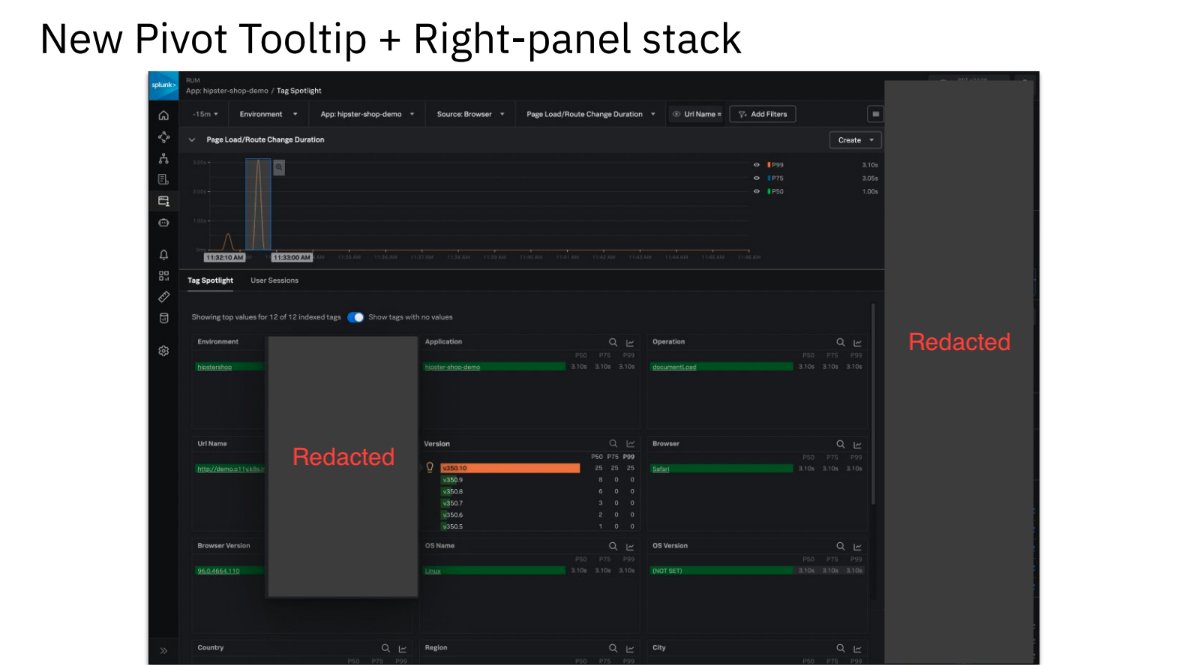
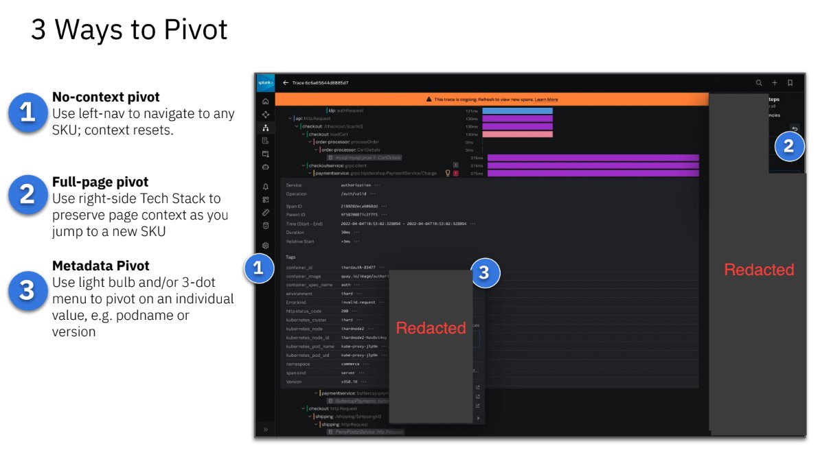
These slides show the final designs we landed upon. Figma screens created by my design partner Alexandra Nuttbrown. Some details have been redacted.
impact
A few notable impacts:
Related Content 2.0 is now live in the Splunk Observability Suite.
Prioritized improvements to existing navigation features: Related Content 2.0, improved breadcrumb navigation.
A product team working on Splunk Cloud (Splunk’s legacy product) reused this concept in a similar feature, which they named “Data Nav” as a homage to this project. (I also worked on this project, see Attaching Observability to Splunk Cloud for more details)
Design principles and research findings from this work informed a suite-wide re-design that aimed for consistency in navigation.
Design leadership asked us to share this process with the entire design org to encourage others to replicate this approach.
challenges & learnings
Taking over an existing project, especially when the project creators are no longer at the company, presents its own challenges. We initially assumed that all of the inherited work was the “right” thing to do. Our most significant progress began once we took time to re-evaluate the inherited project’s problem space and design decisions.
We de-scoped the inherited project and wrote our own PRD, which was the spark that ignited our entire process & empowered us to make it our own.
Rapid testing rounds allowed us to diverge, converge, and repeat.
Regular updates and feedback sessions with product leadership was crucial to maintaining buy-in and ultimately finding a product team to own this work.
Reduct (video analysis user research tool) allowed us to collect clips and analyze quickly, which is necessary during a “rapid” iteration process. It also allowed us to always have evidence and data to back up each decision we made.
This was a design-led vision project that was admittedly lofty and ambitious. Breaking down our output into distinct and implementable components/features increased the likelihood that this would be built.
thank you…
I have been blessed with incredible design partners and leadership at Splunk. This project is yet another example of the impact that design/research collaboration + leadership support can have on a project. Thank you also to the rest of the Observability Design team for their contributions via feedback, participating in ideation sessions, and for listening to repetitive project updates every month.
Alexandra Nuttbrown | Sr. Product Designer
This project would not have been nearly as successful without Lexi. She is an incredible product partner both in talent and enthusiasm.
Danika Patrick | Sr. Manager, Design & User Research
Danika provided Lexi and I the freedom to choose our own work, encouraging us to define and lead our own project even in absence of a PM owner, providing constant feedback and encouragement along the way.
Lisa Platt | Sr. Director of Product Design
Lisa is the design leader that you want in your corner, providing us with an impressive balance between psychological safety and critical feedback.
Sonya Chang | Principal Product Designer
Sonya is a thought leader in the design org, and is my go-to contact for advice and feedback.